
Templates / For designers who draw screens
UI Sketchbook
UI and product designers who draw screens.
Nine frames for the nine states a screen actually has.
$14.99
Instant download · No account · All nine device editions
| Pages | 144 |
|---|---|
| Editions | mono, colour |
| Variants | right hand, left hand |
| Devices | reMarkable 2, reMarkable Paper Pro, reMarkable Paper Pro Move, Kindle Scribe, Kindle Scribe Colorsoft, Supernote Manta, Boox Note Air, A4 Print, US Letter Print |
| Format | Hyperlinked PDF, one file per device |
| Updates | Included, for as long as the template exists |
- 144 pages filed by feature - six features, each with its screens, three state sheets, three components, three spec sheets, two copy sheets and a critique
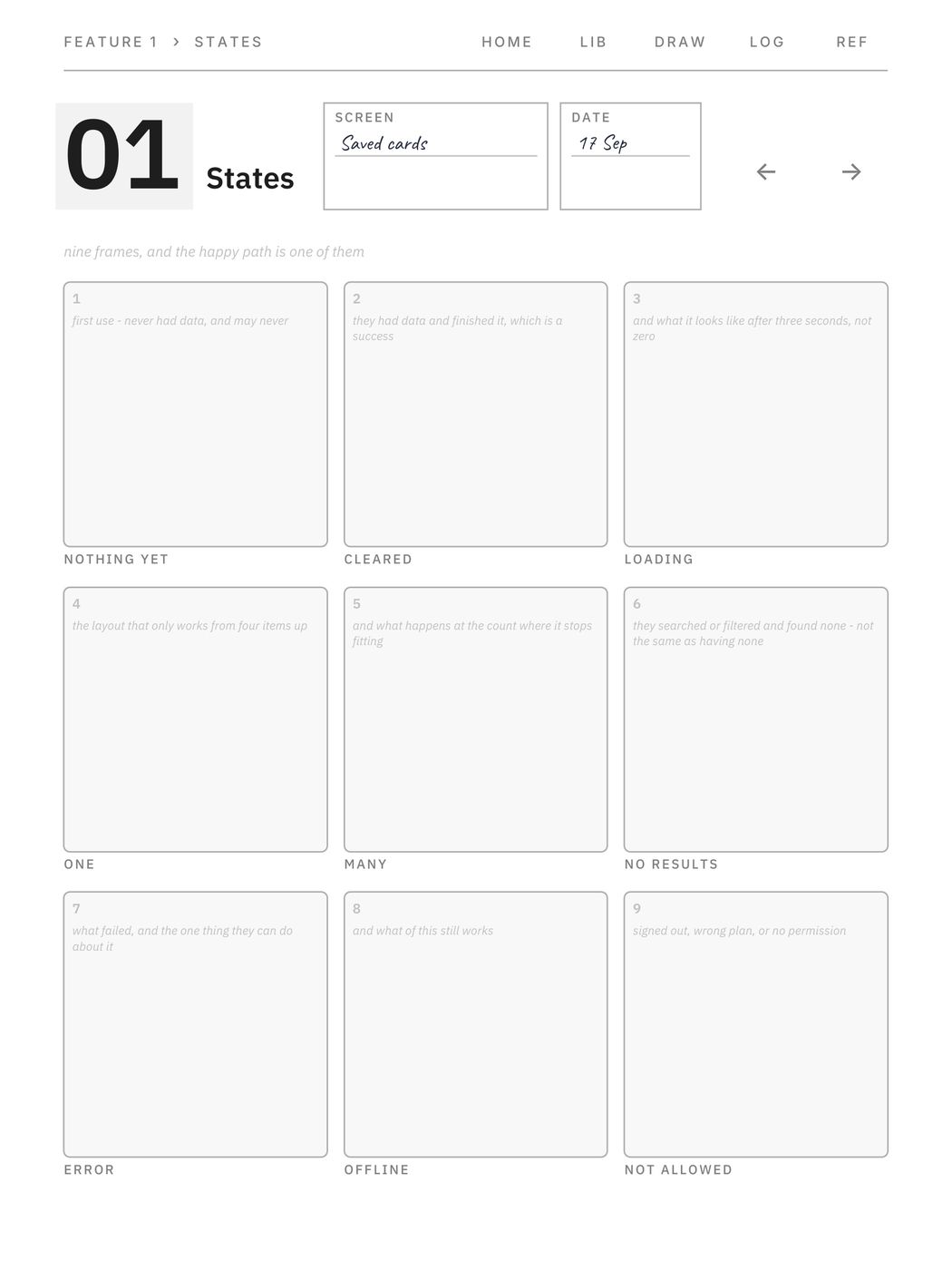
- The state grid: nine frames on one sheet, one per state a screen actually has - nothing yet, cleared, loading, one, many, no results, error, offline, not allowed
- They are printed as frames, not as a checklist, because a frame has to be drawn and a checklist only has to be ticked
- Nothing yet and cleared are separate states, because one is a failure to start and the other is a success - and no results is neither, because the person did something to get there
- Component sheets draw all six interactive states, with the line printed that focus is not hover: a keyboard reaches six and a mouse reaches four
- Spec sheets carry a numbered measurement rail beside the drawing and a unit box at the top, because two redlines in different units cannot be compared and nobody asks
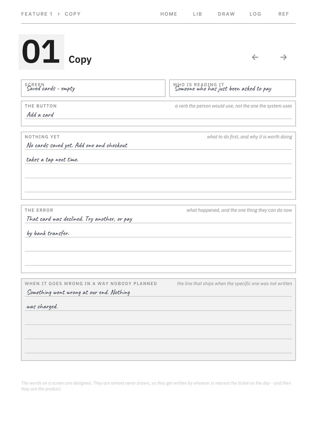
- Copy sheets, because the words on a screen are designed and almost never drawn - including a box for what it says when it goes wrong in a way nobody planned
- No spacing value and no type size is printed: the base is a box you fill in and the multiples follow from it, so the file is not wrong for whichever number your team uses
What is inside
Frames with the states printed beside them — the eight a screen has that nobody draws.
Six features, each with a screen map, three state sheets, three component sheets, three spec sheets, two copy sheets and a critique. Plus a twelve-page component library, thirty-two drawing sheets with a numbered rail, a decision log and a reference section. 144 pages, all linked.
WHAT MAKES IT DIFFERENT
· The state grid puts nine frames on one sheet: nothing yet, cleared, loading, one, many, no results, error, offline, not allowed. You draw the happy path — the list with four items in it — and the other eight get found in QA, or by a user
· They are frames, not a checklist. A frame has to be drawn; a checklist only has to be ticked
· Nothing yet and cleared are separate states. One is a failure to start and the other is a success, and they are not the same screen. No results is neither, because the person did something to get there
· Component sheets draw all six interactive states and print the line that matters: focus is not hover. A keyboard reaches all six and a mouse reaches four, which is exactly why the focus ring ends up undrawn and unbuilt
· Spec sheets carry a numbered measurement rail beside the drawing — ring it, number it, write it in the rail — and a unit box at the top. Two redlines in different units cannot be compared or handed over, and the unit is the field everybody leaves out
· Copy sheets, because the words on a screen are designed and almost never drawn. Including a box for the line that ships when the specific one was not written
· No spacing value and no type size appears anywhere. A spacing system is a base and its multiples; four and eight are both common and neither is a rule, so the base is yours to write and the multiples follow
· The type scale prints the named ratios as arithmetic — 1.200, 1.250, 1.333, 1.618 — which is something you can check, rather than advice
· Frames are rectangles at the right proportion labelled by point size. Not anyone's handset, and no invented safe-area values, because those vary by platform and by year
· No branding inside. You are buying paper, not an advert.