
Templates / For product and UX designers
Design Practice
Product, UX and interaction designers.
Three evaluator columns, because one rating is not reliable.
$14.99
Instant download · No account · All nine device editions
| Pages | 116 |
|---|---|
| Editions | mono, colour |
| Variants | right hand, left hand |
| Devices | reMarkable 2, reMarkable Paper Pro, reMarkable Paper Pro Move, Kindle Scribe, Kindle Scribe Colorsoft, Supernote Manta, Boox Note Air, A4 Print, US Letter Print |
| Format | Hyperlinked PDF, one file per device |
| Updates | Included, for as long as the template exists |
- 116 pages across four projects, in the order the work happens: brief, plan, guide, sessions, findings, map, flow, ideas, frames, critique, evaluation
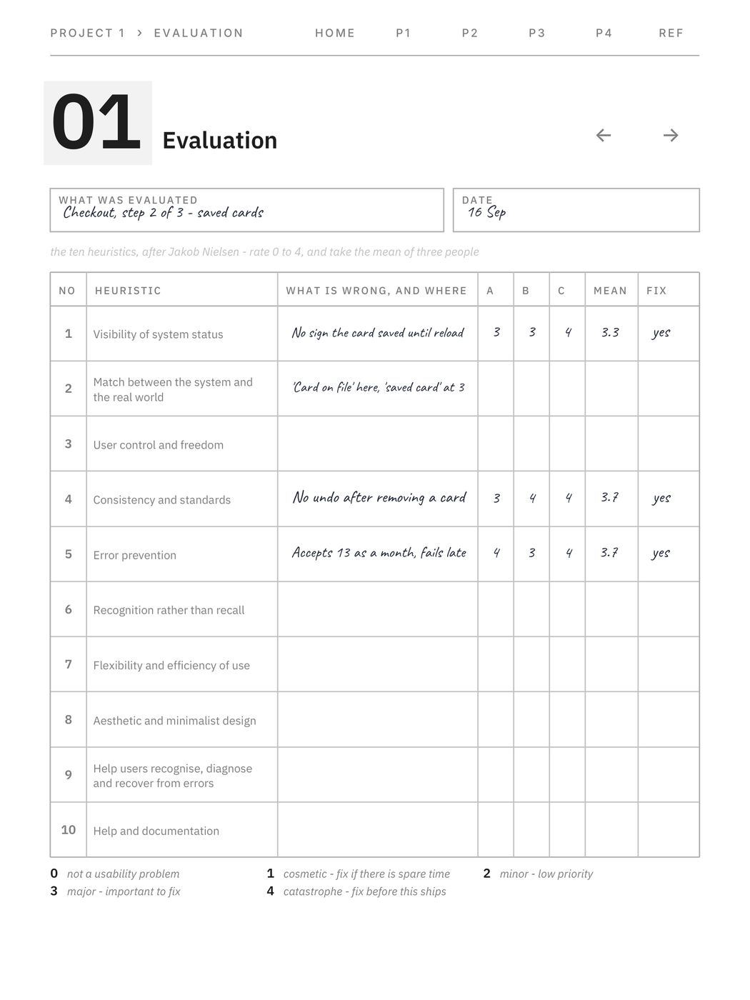
- 8 heuristic evaluation sheets with the ten heuristics down the page and the 0 to 4 severity scale printed in full, labels and all
- Three evaluator columns and a mean, because the people who wrote that scale say a single evaluator's rating is not reliable - no other sheet on sale admits it
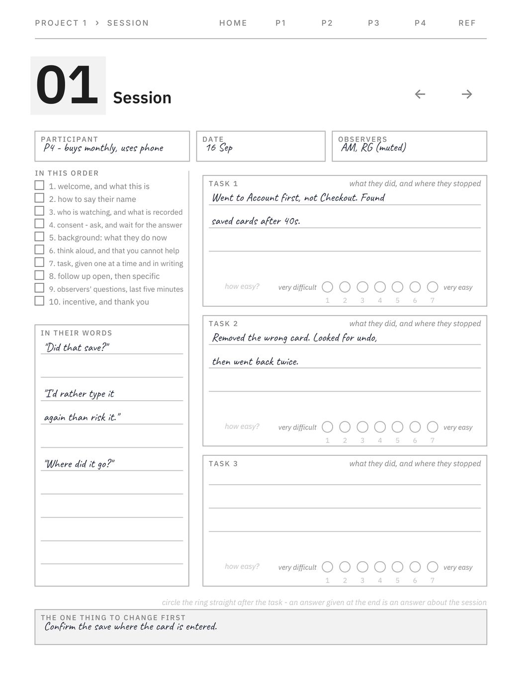
- 16 research session sheets with the moderator's sequence down the rail, in order: consent before background, tasks one at a time and in writing, observers' questions in the last five minutes
- A seven-point ring after every task with both ends labelled - very difficult to very easy - because seven bare circles are a scale whose direction you have to guess
- A flow page with the arrows actually drawn: rounded terminators, square steps, and a diamond at every branch with two lines to label the ways out
- A journey map with the phases across the top and the lanes down the side, and three levels to plot the feeling against so the marks join into a line
- Brief, research plan and interview guide - the three sheets a project starts with, each a question with a wrong answer rather than a box to fill
What is inside
The paper around the drawing — for designers who already have the tools to draw in.
Four projects, each running in the order the work actually happens: brief, research plan, interview guide, four research sessions, synthesis, a journey map, flows, eight-frame idea sheets, drawing sheets with an annotation rail, critique, heuristic evaluation and accessibility checks. Plus a decision log and a reference section. 116 pages, all linked.
WHAT MAKES IT DIFFERENT
· The heuristic evaluation prints the ten heuristics down the page and the 0–4 severity scale in full, with its labels — a rating whose labels are missing is a number people argue about
· Three evaluator columns and a mean, because the authors of that scale say one evaluator's rating is not reliable. Nothing else on sale acts on that
· The session sheet runs the moderator's sequence down the rail in the order people get wrong: consent before background, tasks one at a time and in writing, observers' questions in the last five minutes
· A seven-point ring after every task, circled straight afterwards — asked at the end of the session, it measures the session. Both ends are labelled, because seven bare circles are a scale whose direction you have to guess
· A flow page with the arrows drawn — rounded terminators, square steps, and a diamond at every branch with two lines to label the ways out. Most flow templates are a grid of numbered boxes and no arrows at all
· A journey map with phases across the top and lanes down the side, and three levels to plot the feeling against so the marks join into a line
· Brief, research plan and interview guide: the three sheets a project starts with. Each field is a question with a wrong answer, which is what stops a brief becoming a mission statement
· The three minimum target sizes side by side: 24 CSS px, 44 pt, 48 dp. Each is correct in its own frame and a designer is asked for all three in the same week
· Contrast ratios quoted with their success criterion, so you can argue from the number instead of asserting it
· Frames are rectangles at the right proportion labelled by point size — not anyone's handset, and no invented safe-area values, because those vary by platform and by year. Beside each one is a numbered annotation rail, which is the thing the free sketchbooks leave out
· A critique that opens with what the screen has to do and closes with the one question you want answered
· No branding inside. You are buying paper, not an advert.